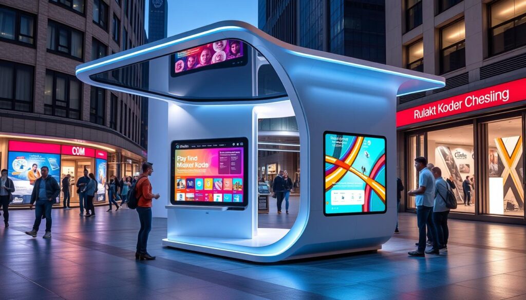
Digital kiosks are key in many fields, making self-service easier and boosting customer interaction. Good kiosk design needs to understand user needs, technical limits, and what works best. It’s about making kiosks that look good and are easy to use, meeting different customer needs in various industries.
Key Takeaways
- Digital kiosks offer a versatile self-service solution for industries like retail, healthcare, hospitality, and transportation.
- Effective kiosk design prioritizes user experience, technical requirements, and functional clarity.
- Considerations like resolution, screen size, and device compatibility are key for creating adaptable and user-friendly kiosks.
- Visually appealing and intuitive interfaces boost customer engagement and make operations more efficient.
- Multilingual support and 24/7 availability meet diverse customer needs.
Understanding Digital Kiosk Design Fundamentals
Creating effective digital kiosks needs a deep grasp of key basics. This includes resolution, device compatibility, and screen size. A common starting point is 2048 x 1536 pixels, fitting for many iPad models. Yet, designs must be flexible to fit different screen sizes and resolutions for a smooth experience on various devices.
Resolution and Device Compatibility
In digital kiosk design, resolution and device compatibility are key. The aim is to make an interface that works well on many touchscreen devices. Knowing the tech needs of the devices helps designers fit on-screen elements like number pads into the design smoothly.
Screen Size Considerations
The kiosk screen size matters a lot. Starting with 2048 x 1536 pixels is common, but designs must be adaptable. Using design templates and overlays helps keep the look consistent across different pages, ensuring a smooth user journey.
Technical Requirements Overview
Good digital kiosk design needs a full grasp of technical needs. Things like color contrast, font size, and layout are critical for an easy-to-use interface. Online tools help designers check color contrast and pick palettes, making the interface appealing and accessible to all.
| Metric | Value |
|---|---|
| Global Interactive Kiosk Market Size (2020) | USD 26.63 billion |
| Global Interactive Kiosk Market Size (2021, Projected) | USD 28.34 billion |
| Automated Teller Machines (ATMs) Market Share (2020) | More than 50.0% |
| Customers Lost Due to Wait Times | Up to 75% |
| Customers Preferring Self-Service Over Speaking to a Representative | 67% |
| Customers Preferring Digital Self-Service Tools for Simple Inquiries | 60% |
By focusing on these design basics, digital kiosk makers can craft interfaces that are both intuitive and user-focused. This boosts the overall experience and customer happiness.
Good Digital Kiosk Design Principles for User Experience
Good digital kiosk design focuses on creating an easy and fun user experience. By following key design principles, kiosks can grab customers’ attention and make their interactions smooth. This boosts user experience, customer engagement, and business success.
Designing clear welcome pages with easy-to-follow instructions is key. Studies reveal that kiosk screens are often too big for users to comfortably stand. Placing interactive elements like keyboards and buttons correctly can make using the kiosk much easier.
Choosing the right colors is also important. The 60/30/10 rule helps create a balanced color scheme that can make users feel certain ways. Also, using fonts like Lexend can make text easier to read on different screens.
“Companies with highly effective UX have increased their revenue by 37%, according to Capgemini.”
As the kiosk industry moves towards full solutions, following accessibility guidelines like WCAG and ADA is essential. This ensures intuitive interface designs that work for everyone, making experiences more inclusive and user-friendly.
By following these design principles, businesses can make kiosk experiences that are both beautiful and easy to use. This leads to happier customers and more loyalty.
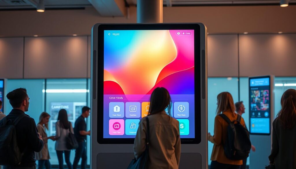
Creating Effective Welcome Screens and Navigation
Making a great first impression is key for engaging visitors. The welcome screen should be clean and easy to use. It should clearly show what the kiosk does and guide users through their options.
The design should fit well with the kiosk’s features, like number pads and keyboards. This ensures a smooth and customer-centric experience.
First Impression Optimization
The welcome page is the first thing users see. It’s vital to make a strong impression. The check-in button text should be short and clear.
There should be enough space for logos and branding. Adding interactive branding through visuals or animations can make the welcome screen more appealing and memorable.
Button Placement and Sizing
Choosing the right spot and size for buttons is important. Buttons should be easy to see and reach, for everyone. This makes the digital kiosk more usable.
Buttons that are the right size, with enough space around them, improve the user experience. It also encourages users to interact more.
Navigation Flow Best Practices
A good navigation system is key. It should be easy to follow and have clear signs. Visual cues, like highlighted paths, help users move through the kiosk confidently.
This makes their experience better and keeps them engaged with the digital platform.
| Feature | Benefit |
|---|---|
| Intuitive welcome screen design | Immediately communicates the kiosk’s purpose and guides users through the available options. |
| Customizable button placement and sizing | Improves usability and encourages engagement by ensuring visibility and easy accessibility. |
| Logical and straightforward navigation flow | Enhances the overall user experience and fosters deeper engagement with the digital platform. |
Visual Elements and Interface Components
Visual elements and interface components are key to a great digital kiosk experience. Choosing colors wisely can make users feel certain ways and act in certain ways. The 60/30/10 rule helps create a balanced and attractive color scheme.
Typography is also important. It must be easy to read on different screens and from various distances. This ensures everyone can use the kiosk without trouble.
Design templates and overlays help designers see how everything fits together. Tools for checking color contrast and picking palettes make the interface more accessible and beautiful. The aim is to make an interface that looks good and works well, boosting the user’s experience and the brand’s image.
Designers who balance visual design with user interface elements create a great experience. This approach leads to more customer engagement, better brand recognition, and improved business results.
FAQ
What are the key considerations for good digital kiosk design?
Good digital kiosk design aims to make the user experience easy and fun. It starts with a simple welcome page that shows clear instructions and how to navigate. The design should also have interactive elements like keyboards and buttons placed well.
Choosing the right colors and fonts is also important. This makes the design easy to read and look at.
How important is device compatibility and screen size when designing digital kiosks?
Device compatibility and screen size are very important. A good starting point is a design for 2048 x 1536 pixels, fitting many iPad models. But, designs must work well on different screens and resolutions.
What are some technical requirements to consider when designing digital kiosks?
Technical needs for digital kiosks include fitting elements like number pads and keyboards into the design. Designs must also work well on various devices and platforms.
How can the welcome screen and navigation enhance the user experience?
A good welcome screen and navigation are key to a great first impression. The welcome page should be simple and clear. Navigation should be easy and logical.
This makes the user experience better and encourages them to use the kiosk more.
What role do visual elements and interface components play in kiosk design?
Visual elements and interface parts are very important in kiosk design. Colors can affect how users feel and act, with the 60/30/10 rule helping to balance them. Choosing the right fonts is also key for easy reading.
Using design templates and overlays helps see how everything fits together in the kiosk interface.